


I'll try to improve.Super Racer Z wrote:Hives wrote:Thanks Freedom!
Sorry if it sucks.
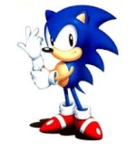
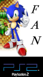
That's pretty good. Although, you need to find a higher quality version of that sonic pic, and need to crop it from it's background a little better, so it's not blurry and doesn't have a blocky black edge around some of it. The font is also a little generic, but change those and you'd have a very good banner.
+13
SonicFanPS2
Bliz
Gamma The Great
Super Racer Z
NeoMetalSonic
Army
Jmh
The Freedom Fighter
Pianta
XNinjaRed
Gin93
Zez
JollyBeta
17 posters
Banners
Jmh


:
 67
67
Age: : 29
Posts: : 7103


Gamma The Great

 2
2
Posts: : 1394
I await to see what others have come up with besides the only one who has actually done anything which is Jmh.
The Freedom Fighter


:76
Age: : 35
Posts: : 5812
So, where is everyone and their work? I know we got a couple of artists here, and I know a few of you, like X and HTG, did want to do something like this. So come on, show us your goods.

Jmh
:67
Age: : 29
Posts: : 7103
I'm going to make another one now....
SonicFanPS2
:12
Age: : 71
Posts: : 2090
I'd also like to try my hand at making these banners.
SonicFanPS2
:12
Age: : 71
Posts: : 2090
Phew. I'm done! I made two types: The ethereal banner and the normal banner:

- It's made to look like the characters are pictures on the ground, and Sonic looks like he's pointing at the forum website!

- I tried to make it glow, like making it ethereal.
- It's made to look like the characters are pictures on the ground, and Sonic looks like he's pointing at the forum website!
- I tried to make it glow, like making it ethereal.
The Freedom Fighter
:76
Age: : 35
Posts: : 5812
The first one is pretty good, although it has the problem of being kinda small. Also, Sonic look kinda compressed, making him shorter than he needs to be.
The ethereal glow I don't really notice. I see it's brighter in places, but otherwise not much of a change.
Either way, with some touchup, it'll be even better than it already is.
The ethereal glow I don't really notice. I see it's brighter in places, but otherwise not much of a change.
Either way, with some touchup, it'll be even better than it already is.
SonicFanPS2
:12
Age: : 71
Posts: : 2090
The Freedom Fighter wrote:The first one is pretty good, although it has the problem of being kinda small. Also, Sonic look kinda compressed, making him shorter than he needs to be.
The ethereal glow I don't really notice. I see it's brighter in places, but otherwise not much of a change.
Either way, with some touchup, it'll be even better than it already is.
Thanks for the advice! I wanted to make it wider, but then Sonic would look awkward, but if i made the length too big, it may be too big for a banner.
sykog
:29
Age: : 30
Posts: : 8839
That's great. Just make Sonic normal shaped (the banner won be too big), and use a darker background so it fits the site more.
SonicFanPS2
:12
Age: : 71
Posts: : 2090
sykog77 wrote:That's great. Just make Sonic normal shaped (the banner won be too big), and use a darker background so it fits the site more.
Thanks, Sykog! I'm sorta thinking of redo-ing the entire thing over again seeing as I did this on Paint.NET and I can't fix it...

TheShadowWalker
:3
Age: : 29
Posts: : 2366
Now that is a good banner!XNinjaRed wrote:
sykog
:29
Age: : 30
Posts: : 8839
I like our current one better. That's yours too isn't it?XNinjaRed wrote:

XNinjaRed
:4
Age: : 33
Posts: : 1681
Yeah, but seeing how I have to make a new one for this little contest I simply whipped up this new one.
The Freedom Fighter
:76
Age: : 35
Posts: : 5812
That's pretty good. The effects are quite nice.
SonicFanPS2
:12
Age: : 71
Posts: : 2090
XNinjaRed wrote:
That's awesome! It has that "KAPOW" feeling to it!
I also made a new version of the banner I showed you guys this morning. 4, to be exact.
Normal Version:

Thats the original. This is when I began to change the image around into different versions.
Darker Version:

Like Sykog advised it to be darker, I tried to make it darker, but still see-able.
Glowing Version:

This one has more glow than the previous.
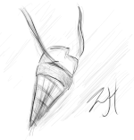
Ink Sketch Version:

This one was made to look like it was drawn.
sykog
:29
Age: : 30
Posts: : 8839
SonicFanPS2 wrote:XNinjaRed wrote:
That's awesome! It has that "KAPOW" feeling to it!
I also made a new version of the banner I showed you guys this morning. 4, to be exact.
Normal Version:
Thats the original. This is when I began to change the image around into different versions.
Darker Version:
I actually meant the background to be darker, not the picture. And it would be cool to have the drawing style just for the characters at the bottom.
Like Sykog advised it to be darker, I tried to make it darker, but still see-able.
Glowing Version:
This one has more glow than the previous.
Ink Sketch Version:
This one was made to look like it was drawn.
The Freedom Fighter
:76
Age: : 35
Posts: : 5812
Yeah, I really like the drawing idea sykog made. But yeah, those are pretty good.sykog77 wrote:I actually meant the background to be darker, not the picture. And it would be cool to have the drawing style just for the characters at the bottom.
sykog
:29
Age: : 30
Posts: : 8839
I'm trying to work on it right now.
SonicFanPS2
:12
Age: : 71
Posts: : 2090
The Freedom Fighter wrote:Yeah, I really like the drawing idea sykog made. But yeah, those are pretty good.sykog77 wrote:I actually meant the background to be darker, not the picture. And it would be cool to have the drawing style just for the characters at the bottom.
Thanks for the advice! I'll get to it tomorrow, since it's really late right now....
sykog
:29
Age: : 30
Posts: : 8839
This is what I mean:

SonicFanPS2
:12
Age: : 71
Posts: : 2090
sykog77 wrote:This is what I mean:
Oh wow! That looks incredible!
sykog
:29
Age: : 30
Posts: : 8839
Well thank you! (Even though you did most of it)SonicFanPS2 wrote:sykog77 wrote:This is what I mean:
Oh wow! That looks incredible!
Zez
:24
Posts: : 8707

These three are my favorite banners. I think the latter two have really basic titles, also, the TSC is unnecessary, The Sonic Community is the title, TSC is slang. I'd say using X's title on the sketch style banner would be a good combination. Though, none of them surpass our current banner.
|
|
|
